A project on Cloudflare: the room-booking app that started on a whiteboard
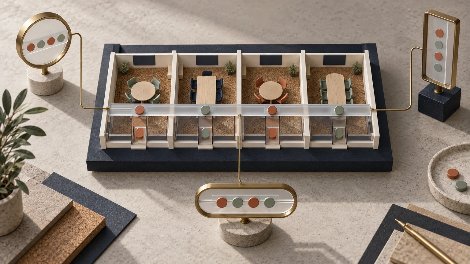
Web platform tools and coding agents make possible something that used to take a whole team: a small group having a tool built to its own measure. This one belongs to a cowork that ran its two meeting rooms on a physical whiteboard, where finding out whether one was free meant walking over to it. Moving that information to the phone with Cloudflare Pages and a D1 database was the easy part; the rest was designing asynchronous coordination, which is how nearly everyone works now.
While browsing around I came across a mention of Cloudflare Workers. I had a vague idea of Cloudflare as this giant of network infrastructure, that famous image alluding to the complicated ecosystem where the largest network of human information is interconnected. Out of curiosity, and because of my background with the cloud, I decided to look into it. I went to the site and understood a bit of the dynamic: Workers was a way to use the tools this giant has built over years, but now in anyone’s hands. What caught my attention most was the database system built on SQLite, which there is called D1. There were thousands of things, one of which struck me as strange, but I grew familiar with it.
Getting to know a platform does not give you mastery of it in a day, nor even understanding. Even so I kept at it, and out of that came the idea of giving my site (this site) its own domain. Then I started trying the services and the wrangler client, which is how you drive Cloudflare from the command line and which, helped by Claude Code, OpenCode or whichever agent you prefer, amounts to astonishing power. I experimented with data-focused mock-ups, then migrated my frontend pages onto Pages and Workers, used the services to set up my own email (you can write to me at [email protected]) and from there kept going with many of the things the free tier offers.
The tower
That image I mention above is this one:
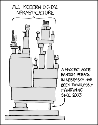
It is xkcd 2347, by Randall Munroe, published under CC BY-NC 2.5. The version going around for a while now draws an arrow at that thin block near the bottom and writes “Cloudflare” over it.
And that joke describes, almost literally, this project’s architecture. Everything on top is what I wrote, and it is the small part: booking in three taps, an HTML file with its CSS and JavaScript, the API on Pages Functions and the database on D1. Underneath sit the TLS, the DNS, the caching and the global delivery network, which I never touched and would not know how to build. Without the thin block, none of what sits above it would be viable for one person working on a two-room cowork.
All of that introduction is about booking rooms
The application is nothing more than a database aimed at the person who needs to announce that they are going to occupy a space: organizing physical space inside the space of semiconductors, so that anyone who needs to know can organize around that space asynchronously.
Before the app there was a whiteboard, in a room separate from the meeting rooms themselves.
A whiteboard has one limitation that does not depend on how it is organized: you have to be standing in front of it. To find out whether the big room is free at eleven you have to walk over there, and anyone not in the building cannot know, cannot book, and cannot say they no longer need it. All the information lives on a wall.
And the chance to take something to production (a small one, truly) was this room-booking business, which runs on a SQLite database. That last part matters because the number of users will be twenty people at most, and having that clear and in view is the most incredible bit: to me, every production database had to be Postgres, and with Cloudflare that is no longer so.
The application was hard to build, but not because of the code. I leaned entirely on coding agents. It was hard because of the design, the organization, and because the transactional properties of a database never matter as much as when that database is a mapping of a physical place. You cannot have two meetings at the same time in the same place.
So what follows are the problems I had to solve, which are nothing more than thinking through and architecting a very simple task: writing on a gridded canvas who is going to use the room, and when.
One clarification before continuing. The app is deployed but has not launched yet: the whiteboard is still the method in force as I write this. So there are no usage stories or adoption metrics here, but decisions and the reasoning behind each one, which is exactly what I want on paper before contact with reality rearranges it.
What it actually competes against
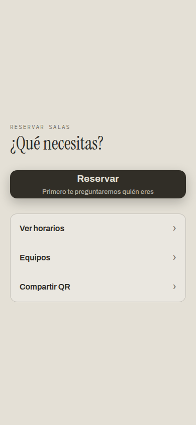
The first version had no users. You opened the URL, saw the schedule, tapped a free hour, typed your name, done.
That was not laziness, it was taking seriously what this competes against. An internal tool does not compete against another booking app: it competes against the whiteboard. And a whiteboard asks for no account, never goes down, sends no verification emails and has no learning curve. That is the bar to clear, and it is higher than it looks.
From there came the rule that survived every later change: looking at the schedule never asks for anything. The URL is public, anyone who passes by sees which rooms are taken and moves on, the same as standing in front of the board. Booking does require identifying yourself, because a booking is a commitment with a name on it, which is why the button says so from the home screen instead of ambushing you at step three.
One action at a time
If I had to keep a single principle out of the whole design, it would be this: each screen asks one question.
It is not an aesthetic preference. A tool used standing up, phone in one hand and coffee in the other, thirty seconds before a meeting, cannot ask you to fill in a form. It can ask you to answer one thing, and then another.
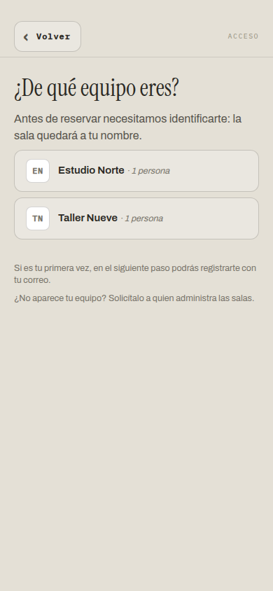
Identifying yourself is two questions: which team you are on, and who you are within it. Nothing else on that screen. Below, one line explains what is about to happen before it happens.
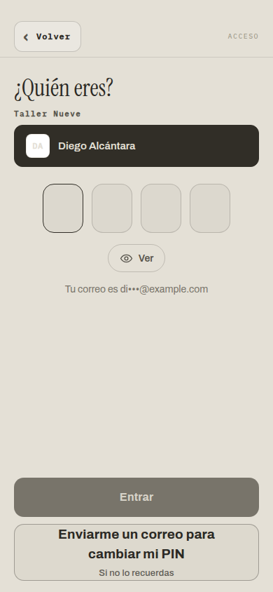
Choosing your name brings up the PIN, in four boxes with its little eye, like at an ATM. Copying an interface people have used a thousand times saves all of the explaining. And your masked email appears, di•••@example.com, so you recognize your account before anything is asked of you.
That bottom button changes with the screen, and that fix took a while to see. It used to say “Enter with my email” at three moments where it meant three different things: signing up, recovering a forgotten PIN, or changing the one you have. With the list of people in front of you it says register; with a person already selected, who by definition is already registered, it says change my PIN. In a demo the person presenting knows what every button does. The person opening the app on a Wednesday at 10:55 does not.
Booking follows the same pattern: room, time, duration. Three screens, three questions.
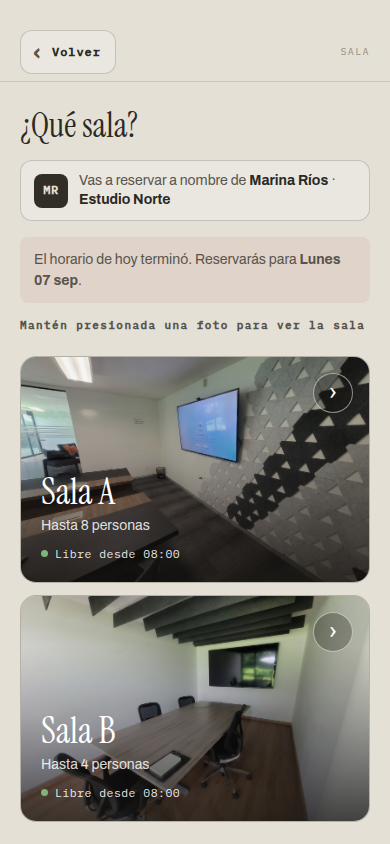
Three things I learned to put on that one screen: who you are (so the booking does not come out in the wrong name), which day it will land on (if today’s schedule is over, it says so rather than letting you find out), and that the photos can be held down to see the whole room, because a gesture nobody told you about does not exist.
Saying “busy” is not an answer
The first version of the schedule said which team had the room, and stopped there. It looked correct and it was not enough.
If you need the room and it is taken, knowing the team does not help much: what you want is who to ask whether they need the whole hour, whether they can lend you thirty minutes, or whether it was cancelled and nobody released it. A schedule that gives no name forces you out of the app to find out, which is exactly the work the app was there to remove.
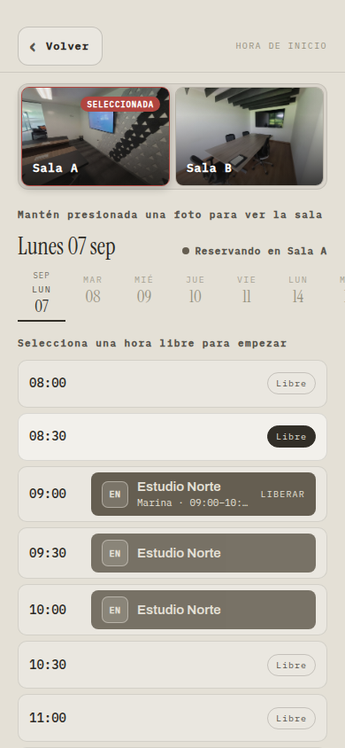
Now every block says who booked it, with their name and their team. It is a one-line change in the query and I think it is the one that will matter most. Behind it sits a detail that looks minor and is not: the name is stored copied into the booking, not just referenced. If that person ever leaves, the schedule still says whose meeting it was. A booking that becomes anonymous over time is a booking nobody will touch, just in case.
That screenshot also shows the room strip pinned to the top. The schedule is two and a half screens of scrolling, and losing sight of which room you are in means losing the thread.
Who gets to release a room
This was the hardest decision in the whole project, and it has nothing to do with programming.
Releasing has to be easy, because a room booked and not used is worse than a room in use: it blocks everyone else and serves nobody. But if releasing is easy for anyone, then anyone can release your meeting half an hour before it starts.
The first design was the simplest: whoever books keeps a key in their browser, and only that key releases. It works like a coat check ticket: it does not say who you are, but it proves you left the coat. The hole shows up the moment you walk it on two devices: if you book from the laptop and want to release from the phone, the key is in the other browser.
The second design added the booker’s PIN as a second key. That closes the phone case, but leaves the social question untouched: what if a room genuinely needs releasing because that person never showed and there are people waiting outside?
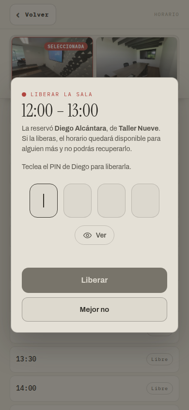
The third design is the one that stuck, and it is not technical either. Every release leaves a visible record: the freed slot does not simply show up empty, it says who released it and whose it was. Nobody is prevented, everybody can see.
The contrast with the whiteboard helps show why. On a wall, erasing what someone wrote is physically possible and leaves no trace: permission is wide open and the record does not exist. A database can do the exact opposite of what the wall lacks, and keeping the permission while adding the signature struck me as better than removing the permission. Hard rules invite workarounds; visibility makes almost nobody want to try.
The rare case is not an error
For a while the app asked for your team twice: once when identifying you, once when booking. Each screen made sense on its own, and together they made you retype something the app had shown you two screens earlier. Now the team is chosen once, at the door, and travels with the person.
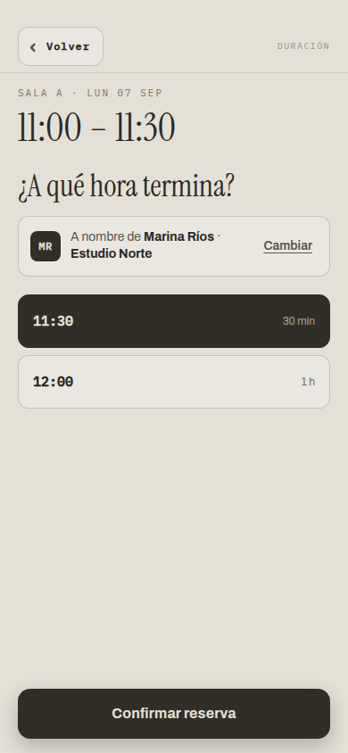
That “Change” on the right matters more than it looks. Most of the time you book for your own team and that line just confirms. But sometimes the room goes in someone else’s name, and without the escape hatch the only way to do it would be to log out. An internal tool cannot treat the rare case as an error.
There was a session detail that took a while to see. The app remembered the last team in the browser, and that sat badly with being logged in: on a borrowed phone the room would have come out in the previous owner’s team name. Now the session always wins over the browser’s memory. In a shared space, a borrowed phone is not an exotic scenario.
10:05 is still ten o’clock
A rule that seemed obvious and was wrong: the moment the clock hit 10:01, the 10:00 block could no longer be booked.
Correct for a clock, absurd for a room. At 10:05 there are twenty-five perfectly usable minutes left, and whoever is standing in the doorway will want exactly that block. Now a block stays available until it ends: at 10:18 you can still take the 10:00 one, and at 10:30 you cannot. The rule is computed in the cowork’s time zone, not the server’s and not the phone’s, because all three can differ and only one is right.
The keyboard covered the one button that matters
This one is my favourite, because it is invisible on a laptop and lethal on a phone.
The confirm button sits pinned to the bottom. When the phone keyboard opens, it opens on top of it: at the exact moment you finish typing your PIN, the button to confirm it sits behind the keyboard. Now the app measures how much the keyboard takes and lifts the footer by that much, and the dialog where the PIN is typed centres itself on what is visible rather than on what the keyboard hides.
Nobody will ever notice this fix. That is the point: it belongs to the kind you only notice when they are missing.
Finishing is a screen too
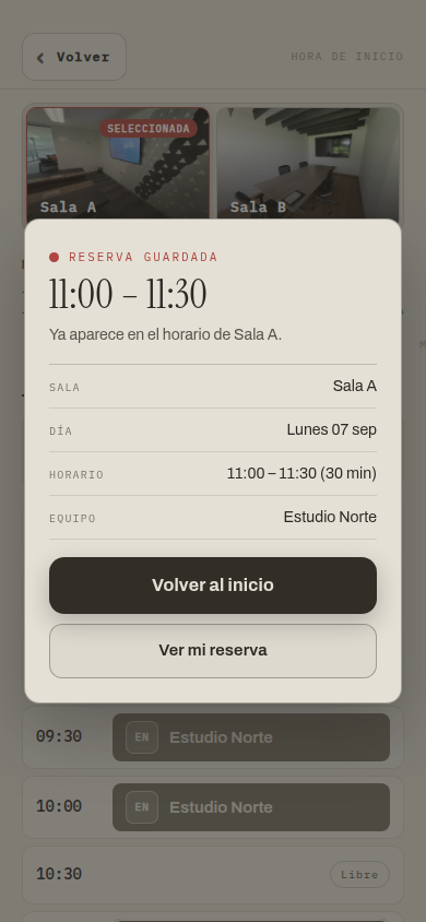
The second button used to say “Book another”, which was the name of what it did, not of what anyone would want next. After booking, the natural thing is not to book another: it is to check that it went through. Now it says “See my booking” and opens that room’s schedule in read mode, with your row marked.
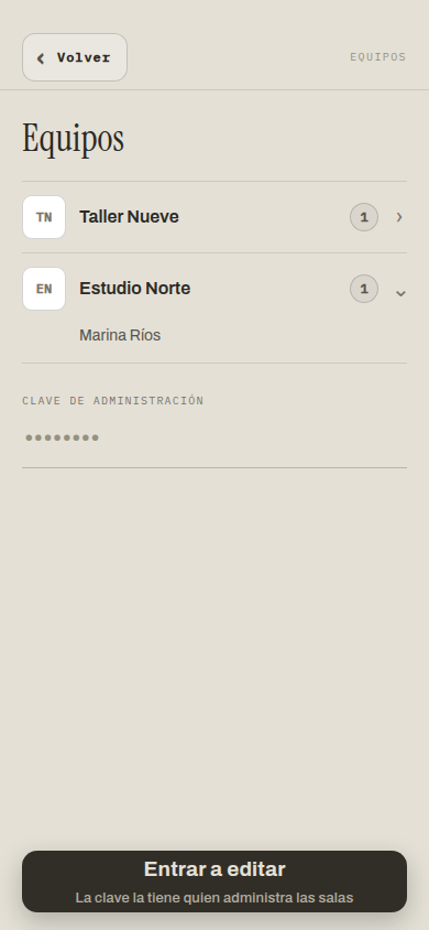
And the teams screen had its own reading fix. It used to show members always, and a team with a single person under it read as if that person owned it. Now the row says how many they are, and the names appear when you tap it.
The email, or how much power fits in a free tier
This part deserves its own section, because it is what surprised me most.
There are two emails in this story and it is worth separating them. The first is mine: [email protected] exists because Cloudflare routes email for your own domain without charging for it. The second is the application’s, the one that reaches whoever registers, and that goes out through Resend, another service whose free tier is more than enough for a cowork.
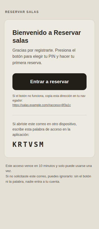
Making an email look like that costs more than it seems. It is laid out with tables and inline styles, because mailboxes strip style blocks. It carries no images at all, because most clients block them by default and an email whose button is a blocked image has no button. The button’s colour is written twice, in the attribute and in the style, because some clients ignore one of the two. And under the button sits the address in plain text, in case none of the above survives.
It carries two keys from the same row: the button, which walks you in without typing, and a six-letter word for when you open the email on another device. They share a single use, so one email opens the door once.
The remarkable thing is not the email. It is that one person can put this together. Your own domain with a certificate, a managed database with backups, an API distributed worldwide, and a delivery service that lands in the inbox rather than spam: not so many years ago that was an infrastructure team and a monthly invoice. Today it fits in a free tier and a few afternoons, and it serves a group of twenty people with the same solidity it would serve one of two thousand.
I do not say this as advertising. I say it because there is something there worth thanking that does not always get named: that free tier exists because a lot of people built, paid for and maintained the infrastructure before I arrived. Writing this process down is my way of giving something back. If someone finds it and it helps them take their own tool to something with production quality, the text has done its job.
And there is a second debt of the same kind. I leaned entirely on coding agents, which are the maximum corpus and the shoulders of giants: they encompass all the dead who lived and bequeathed their knowledge. The app is where those two inheritances cross, accumulated knowledge and accumulated infrastructure, put at the service of a fairly modest question: is the room free at eleven?
The door, briefly
Identifying yourself had to cost little or nobody would do it, and one more password was not an option: nobody wants to invent one to book a room, and the ones that would get invented would be bad.
Two secrets remained, with different jobs. The word from the email works once and lives ten minutes; its only job is to prove that email is yours. The four-digit PIN is the everyday door. Only encrypted versions of both live in the database, so a leak lets nobody in.
Four digits are ten thousand combinations and the list of names is public, so what actually guards the door is not the encryption but the attempt cap: five failures and the account closes for an hour. That produced the most interesting problem in the project, and it is usability wearing a security costume: because the cap applied to anything that arrived, sending five empty requests was enough to lock a person out for an hour without their having typed a single PIN. The lock meant to stop a guesser worked to block someone who had done nothing.
And one last one, a known trap and therefore solved up front. Plenty of corporate mail services open links before you do, to scan them. If the link works once, that scanner spends it and the person receives a dead access they never touched. The key travels hidden in the part of the address that never reaches the server, so the robot requests the page and gets nothing. It is somebody else’s security feature that, if you do not anticipate it, shows up as a broken app.
What I still do not know
Everything above are decisions made before launch, so it is worth saying out loud what they are: reasoned bets, not results.
The biggest is the one about visibility. I bet that showing who released each room is enough to keep people from releasing other people’s bookings lightly, rather than forbidding it. If I am wrong it will show quickly, and the fix is probably asking for a reason, not closing the door.
The second is that a four-digit PIN is the right balance between “do not ask me for another password” and “this has to be yours”. If it turns out people forget it every couple of weeks, the email route stops being an emergency exit and becomes the main road.
The third is that each person belongs to one team. In a cowork people float between projects, and if that happens often, one team per person will get in the way more than it organizes.
There is also a deeper decision still unmade: email signup does not restrict domains, so any email that exists can create an account. For a small space that turned out to be the practical choice, which is why creating teams still sits behind an admin key. It is also why I do not attach a link to the app: it is a real workplace’s tool, not a demo, and publishing the address would be inviting strangers to sign up for it.
If this project carries one lesson, it is this: the whiteboard is not badly designed. It does its job; the only thing it cannot do is be somewhere else. Everything else (the identity, the PINs, the emails, the attempt lockout) exists only to support that single improvement. Designing tools for asynchronous coordination has become an unavoidable paradigm now that generative AI puts within one person’s reach what used to take a team, and the hard part still is not the code. It still is deciding who can do what, and how everyone else finds out.
If you want the other half of this story, the one about the domain and the empty DNS panel, it is in how gonor.me became my place on the internet. And the same discipline of not breaking data somebody cares about, applied to something much larger, is in the data platform on GCP.